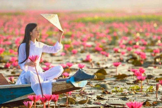
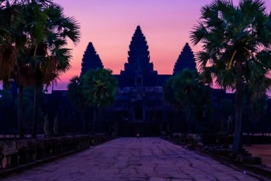

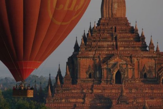
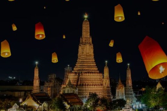
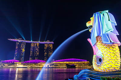

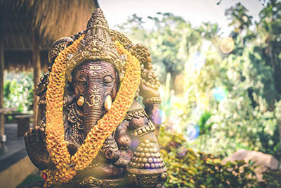
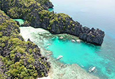
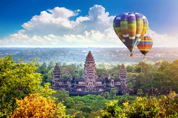
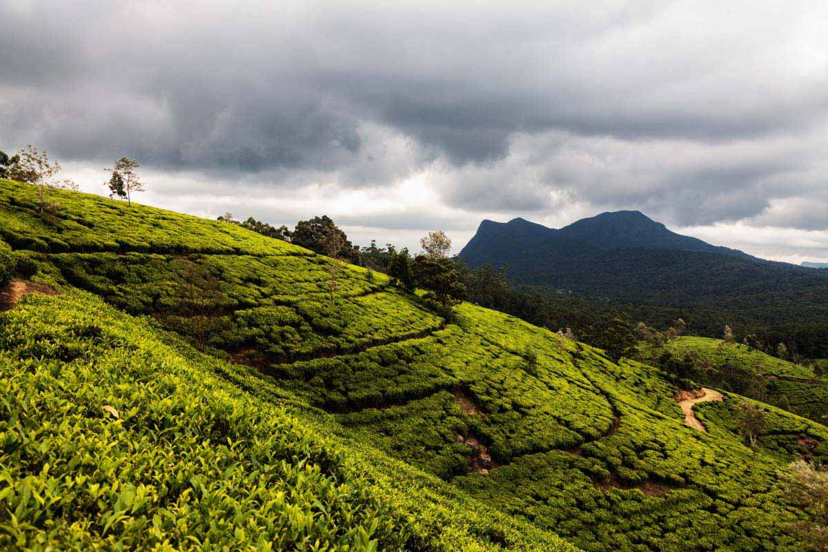
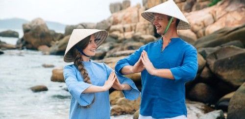
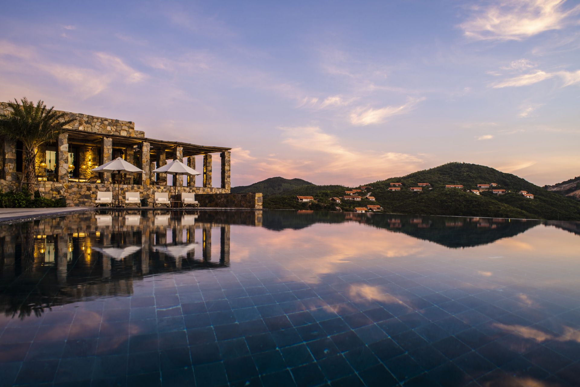
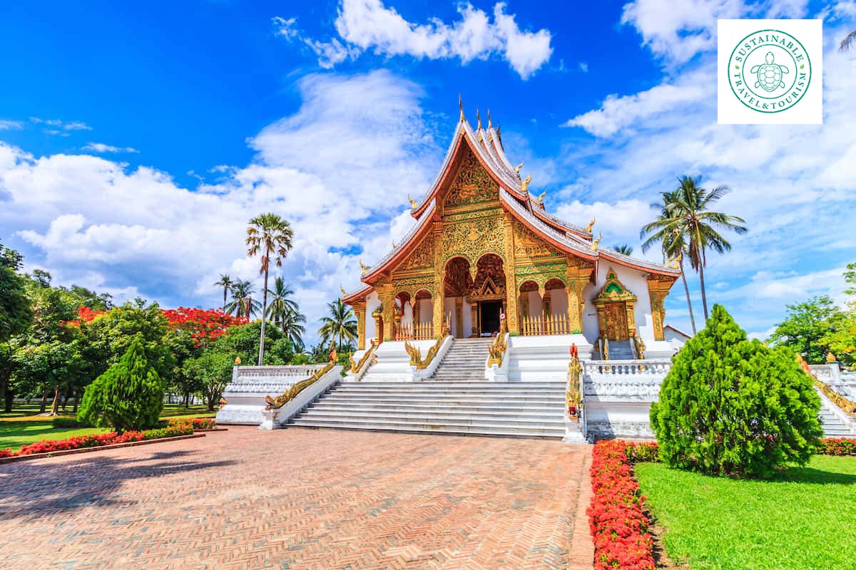
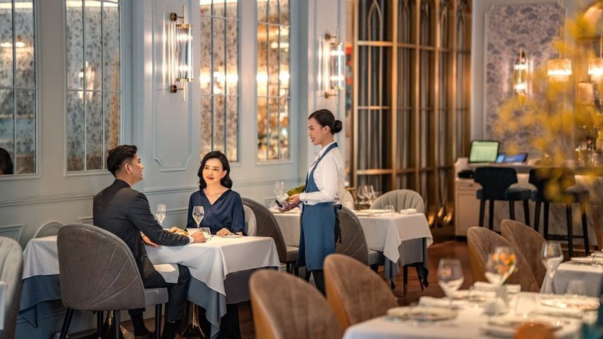
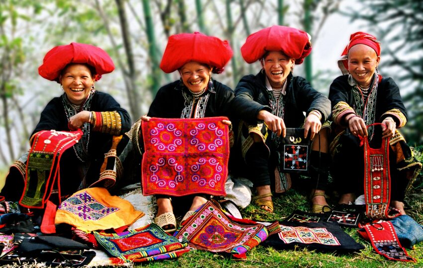
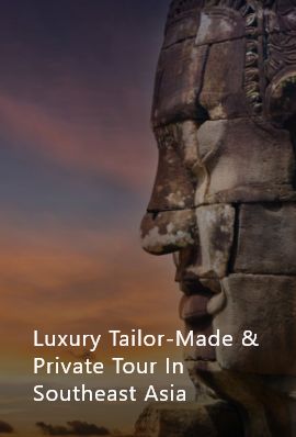
Popular Tours

Logo Meaning
![]()
Lux Travel DMC Asia: Inspiring Journeys
At Lux Travel DMC, every journey is a blend of luxury, sustainability, and happiness, crafted within our ESG-driven organization to ensure complete satisfaction for our travelers.
As we celebrate our 20th anniversary of leadership in luxury travel, excellence, and sustainability, we are excited to unveil our new corporate identity and slogan. This marks the latest phase of Lux Travel DMC's evolution under the LuxGroup, a 'small giant' company committed to delivering happiness through passion, purpose, people, planet, place, profit, partnership, and prosperity. Reflecting our expansion into other destinations across Asia, the name Lux Travel DMC embodies our vision of broadening our reach while maintaining our core values.
Our new logo symbolizes the innovation, creativity, and growth of Lux Travel DMC. The bold, U-shaped 'LUX' emphasizes our focus on you, the traveler, at the heart of every experience. The smaller, central, and smooth 'Travel' font reflects our flexibility in providing tailored services. The design is solid, simple, elegant, and luxurious, with two dominant colors complemented by white.
The black color signifies our high standards, while the gold represents luxury, balance, and stability, underscoring our commitment to win-win solutions. White symbolizes our transparency and integrity.
This refreshed logo encapsulates our core values of excellent service, which we measure through attitude, the art of service, and efficient processes, always putting you at the center of everything we do.
Our team of local and expatriate travel experts possesses the knowledge, skills, and positive attitude to deliver exceptional service to the most discerning travelers.
Our mission is to provide 'Wow' services to the most sophisticated travelers. Our enduring slogan, 'Inspiring Journeys,' remains a powerful message, a firm commitment, and a promise to our clients and partners.


Leave A Reply